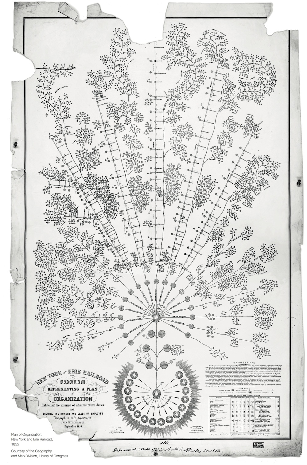
 Read about the first (well documented) org chart here.
Read about the first (well documented) org chart here.
Read about the first (well documented) org chart here.
This is a simple tool for building organization charts. It uses the Google Organizational Chart Visualization API. If you have questions or concerns, please email samuelmclean@google.com.
Make a copy of this sample sheet. Once you've filled in all of the relevant information, copy columns A:D onto your clipboard; when you paste into the field below, the data will be tab separated.
Acceptable color values are - for now - blue, red, yellow, green and gray. I'll add more if there's some pressing need to have more colour options.